A Painted Front Door
Who here loves a painted front door? ME!
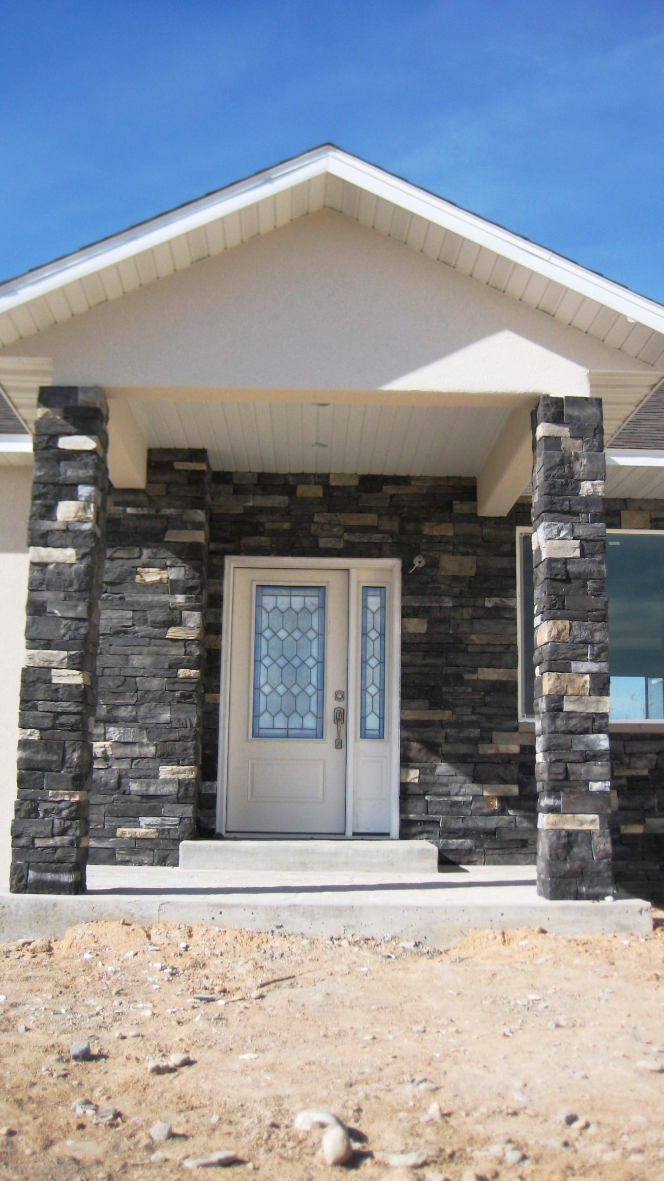
I must say that our original white door looked fine, it just wasn’t enough of a statement and not the type of entrance that I had imagined.
So, I went in search for the perfect paint color. I wanted something that would give visitors a welcoming vibe, but still look classy with our black rock.
We love how it turned out!
But just so you remember, here’s the before:
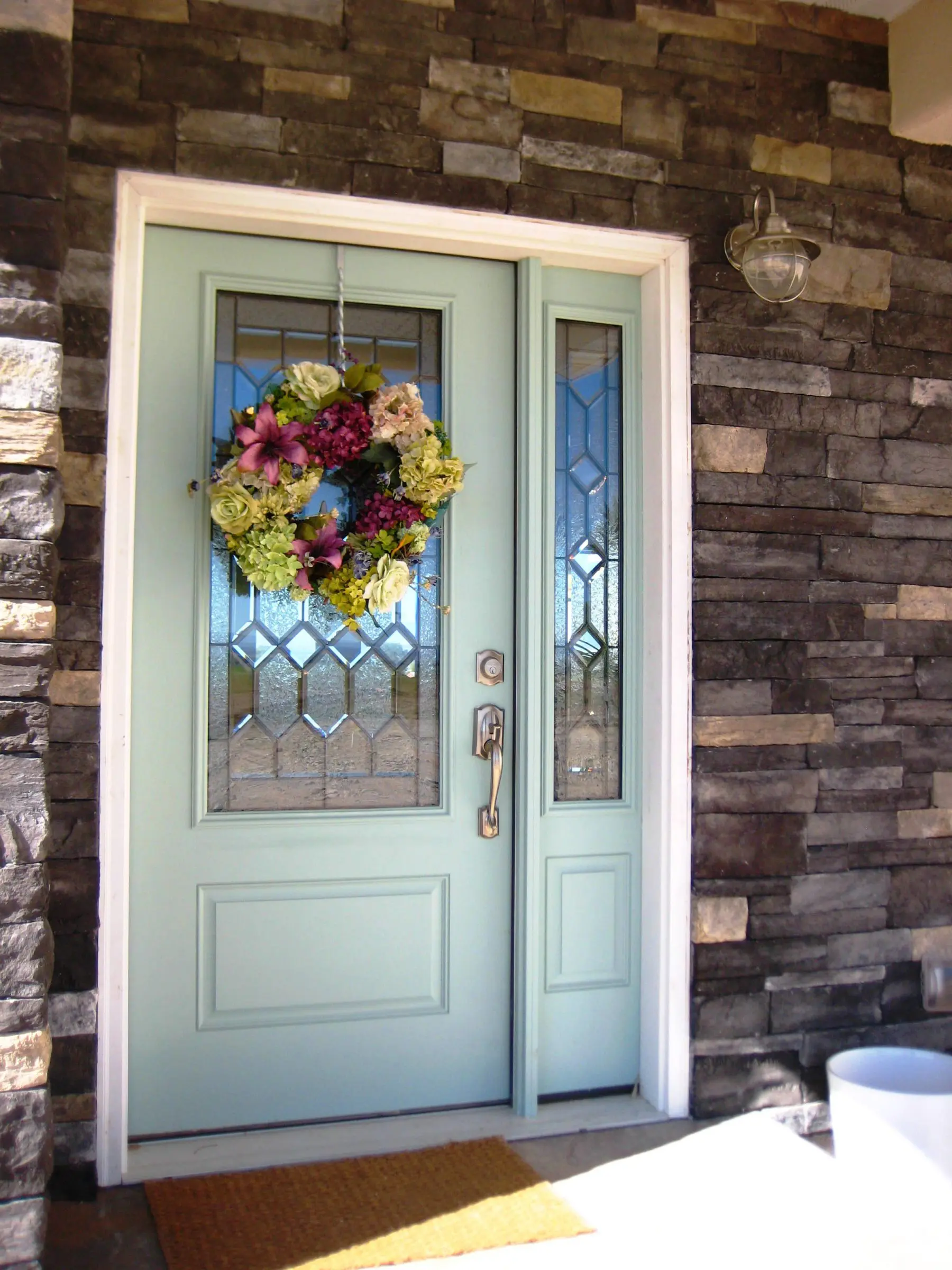
And here’s the after:
We painted the front door Wythe Blue from Benjamin Moore and absolutely love it. It’s the perfect pop against the black rock.
There’s still a ton to do with the front porch, but it’s looking so much better. Obviously my white pots are empty…. I’m on the hunt for some flowers. A new wreath is in order and house numbers are coming soon. It all takes time.
And just because we all love before and after shots, here you go:
There you go! I hope you like it as much as we do!


Hi Shayna, your home is beautiful – I found your blog through Alderberry Hill I believe…This Wyeth Blue is absolutely beautiful and it makes the front door pop in such a great way – I wondered if this is the same blue/green you have inside your home? I noticed you painted a blue/green in your laundry room & bedroom…Is it the same color? Regards – Haydee
Hi Haydee!
Thanks for visiting! I’m so happy you stopped by! 🙂
The blue/ green color in our office (which I think is what you are referring to) is also in our master bathroom. It’s called Palladian Blue from Benjamin Moore. It’s in the same family as the Wythe blue on the front door.
The laundry room color is called Blue Grass by Benjamin Moore.
Our dining room color is also similar to both of these rooms, although it has a touch more gray in it. It’s Tranquility by Benjamin Moore.
I hope that helped!
Big Smiles!
Shayna
Your response was indeed very helpful – I see the different hues now…I love all of them. It is very hard to find the right shade of blue/green but the ones you picked all seem to work very nicely together. I myself was looking at Rainwashed by Sherwin Williams but wanted something a little softer that still had some gray in it. I will get some samples of your colors to try. I look forward to seeing all of your decorating posts 🙂
Thanks again, Haydee
I’m glad it was helpful! Best of luck in finding the “right” color. It can be a tad tricky at times. 😉
Thanks for stopping by!
Big Smiles!
Shayna
Beautiful door lady! I’m obsessed with that color!
THANK YOU! I totally know what you mean! I am obsessed with it too! 🙂
-Shayna